1.5-SVG 标签
Create by fall on 30 Mar 2023
Recently revised in 10 Mar 2024
SVG
svg(Scalable Vector Graphics):可缩放矢量图形,基于文本的开放网络标准,SVG 能够优雅而简洁地渲染矢量图形。
2003 年成为 W3C 推荐标准以来,最接近的“完整版”SVG 版本是 1.1 版,它基于 1.0 版,并且增加了更多便于实现的模块化内容,SVG1.1 的第二个版本在 2011 年成为推荐标准,完整的 SVG1.2 本来是下一个标准版本,但它又被 SVG2.0 取代。
svg 中的所有标签只能在 svg 中发挥对应的作用。
常用的标签:
- path:表示路径
- 形状标签:circle(圆)、rect(矩形)、line(线段)、
- g:分组标签,将 g 上的属性放置在内容中。
- 文本标签:text、tspan
示例
svg 上面的一些属性含义
- height,width 表示宽高,实际展示在页面的宽高
- viewBox 表示画布的宽高,svg 内的数字就是相对于此宽高的坐标
- xmlns:命名空间声明,意味着这个
<svg>标签和它的子节点都属于http://www\.w3.org/2000/svg这个 SVG 命名空间,虽然看起来像 URL
数字和字母之间不用分隔,数字之间必须用空白、逗号、终止命令符或者换行符分隔开。
SVG 2 不推荐使用 version 和 baseProfile 这两个属性。
<svg xmlns="http://www.w3.org/2000/svg" width="400" height="400" viewBox="0 0 48 48">
  <g fill="url('#paint0_linear')" stroke-width="2" stroke-linejoin="round">
    <path d="M18 6H8C6.89543 6 6 6.89543 6 8V18C6 19.1046 6.89543 20 8 20H18C19.1046 20 20 19.1046 20 18V8C20 6.89543 19.1046 6 18 6Z" />
    <path d="M18 28H8C6.89543 28 6 28.8954 6 30V40C6 41.1046 6.89543 42 8 42H18C19.1046 42 20 41.1046 20 40V30C20 28.8954 19.1046 28 18 28Z" />
    <path d="M40 6H30C28.8954 6 28 6.89543 28 8V18C28 19.1046 28.8954 20 30 20H40C41.1046 20 42 19.1046 42 18V8C42 6.89543 41.1046 6 40 6Z" />
    <path d="M40 28H30C28.8954 28 28 28.8954 28 30V40C28 41.1046 28.8954 42 30 42H40C41.1046 42 42 41.1046 42 40V30C42 28.8954 41.1046 28 40 28Z" />
  </g>
  <defs>
    <linearGradient id="paint0_linear" x1="4" y1="4" x2="32" y2="32" gradientUnits="userSpaceOnUse">
      <stop stop-color="#41D1FF" />
      <stop offset="1" stop-color="#BD34FE" />
    </linearGradient>
  </defs>
</svg>
可以通过多个元素调用 svg
<iframe src="image.svg"></iframe>
<object data="image.svg" type="image/svg+xml" />
<img src="image.svg">
特性
svg 允许嵌套 svg 元素,创建一个新的坐标系统
<svg xmlns="http://www.w3.org/2000/svg">
  <svg width="100" height="100" viewBox="0 0 50 50">
    <rect width="50" height="50" />
  </svg>
</svg>
标签
需要注意,所有的标签都必须放置在 <svg> 下面
形状
形状包括:rect(矩形)、circle(圆形)、ellipse(椭圆)、line(线段)polyline(折线)polygon(多边形)
rect(矩形)
rx:圆角的 x 方位的半径
ry:圆角的 y 方位的半径
<rect x="60" y="10" rx="10" ry="10" width="30" height="30" stroke="black" fill="transparent" stroke-width="5"/>
circle(圆形)
<circle cx="25" cy="75" r="20" stroke="red" fill="transparent" stroke-width="5"/>
ellipse(椭圆)
rx,ry 控制长轴半径和短轴半径
<ellipse cx="75" cy="75" rx="20" ry="5" stroke="red" fill="transparent" stroke-width="5"/>
line(线段)
控制两个点之间的内容
<line x1="10" x2="50" y1="110" y2="150" stroke="orange" fill="transparent" stroke-width="5"/>
polyline(折线)
所有的点都放在一个 points 属性中,
<polyline points="60 110 65 120 70 115 75 130 80 125 85 140 90 135 95 150 100 145"
          stroke="orange" fill="transparent" stroke-width="5"/>
polygon
多边形,所有的点都放在一个 points 属性中,会将第一个点和最后一个连接起来
<polygon points="50 160 55 180 70 180 60 190 65 205 50 195 35 205 40 190 30 180 45 180"
         stroke="green" fill="transparent" stroke-width="5"/>
文字文本
包含的标签:text、tspan、textPath、tref
这些文本标签可以使用大部分 CSS 中有关字体的标签,font-family、font-style、font-weight、font-variant、font-stretch、font-size、font-size-adjust、kerning、letter-spacing、word-spacing、text-decoration。
text
字体,在 <svg> 元素内部,任何位置都可以放置字体
<svg version="1.1" xmlns="http://www.w3.org/2000/svg">
  <text x="100" y="100" font-weight="bold" fill="pink" font-size="24" text-anchor="end">Fall</text>
  <!-- text-anchor 表示从哪里开始渲染字体 -->
</svg>
tspan
<tspan> 必须为 <tspan> 或 <text> 的子标签,用于表示一大串字符串的一部分,负责对文字进行精细化处理。
- x 可以为一个数字,确定位置,也可以为
,分隔的数字,依次表示字符的位置。 - dx, rotate, textLength(给出字符串的计算长度),都类似于 x
<text x="20" y="20">
  This is <tspan font-weight="bold" fill="red" x="20,40,60" y="40,40,60">Mr Fall</tspan>
</text>
textPath
通过关联 path 将文字对齐到 path(和曲线对齐)
<path id="my_path" d="M 100 200 Q 200 100 300 200 T 500 200" stroke="rgb(0,255,0)" fill="none" />
<text>
  <textPath xlink:href="#my_path" startOffset="10">This text follows a curve.</textPath>
</text>
tref
<text id="example">This is an example text.</text>
<text>
    <tref xlink:href="#example" />
</text>
路径
路径拥有比形状更多的可塑性,控制路径能画出更多的图形
使用 <path> 画一个矩形
<path d="M10 10H90V90H10z" fill="transparent" stroke="pink" stroke-width="6" />
可以使用的 SVG 元素:<path>。
表示路径,其中有很多字母表示不同的含义,这些命令是大小写敏感的。大写的命令指定绝对坐标,而小写命令指定相对(于当前位置的)坐标。
SVG 使用的坐标系统(所有计算机绘图都差不多),左上角为 (0,0) 坐标点,坐标以像素为单位,x 轴正方向是向右,y 轴正方向是向下。
移动至
M/m(Move to)命令是移动画笔位置,但是不画线,M 命令经常出现在路径的开始处,用来指明从何处开始画。
画线至
L/l(Line to)在当前位置和目标位置中间画一条线,至少需要确定一个 M,再开始画线H/h(horizon)水平移动,只移动 x 轴V/v(vertical)垂直移动,只移动 y 轴
闭合路径
Z/z命令会从当前点画一条直线到路径的起点,这个命令大小写都一样
贝塞尔曲线
- 三次方贝塞尔曲线:
C、c、S、s - 二次方贝塞尔曲线:
Q、q、T、t
<svg width="200px" height="200px" version="1.1"  viewBox="0 0 48 48" xmlns="http://www.w3.org/2000/svg">
  <!-- 移动到 10 10,在 20 20 之间画一条线连接 -->
  <path d="M10 10 l20 20" stroke="magenta"/>
</svg>
应用示例
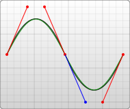
贝塞尔曲线
三次贝塞尔曲线格式
<path d="M 10 10 C 90 10 20 41 20 40" fill="none" stroke="red"/>
<!-- 格式:C x1 y1 x2 y2 x y -->
<!-- x1, y1 表示起点控制坐标 x2, y2 表示终点控制坐标 x,y 表示终点位置 -->
<path d="M 10 10 S 55 40 10 90" fill="none" stroke="pink" stroke-width="2px"/>
<!-- 格式:S x1 y1 x y -->
<!-- x1, y1 表示起点控制坐标 x,y 表示终点位置 -->
如果 S 命令跟在一个 C 或 S 命令的后面,它的第一个控制点,就会被假设成前一个控制点的对称点。
如果 S 命令单独使用,前面没有 C 或 S 命令,那当前点将作为第一个控制点。
二次贝塞尔曲线
<path d="M 10 80  Q 52.5 10, 95 80 T 180 80"  fill="none" stroke="red"/>
<!-- 格式:Q x1 y1 x y -->
<!-- x1 y1 控制点坐标,确定起点和终点的曲线斜率 x, y 表示终点坐标 -->
<!-- 格式:T x y -->
<!-- T 命令前面必须是一个 Q 命令,或者是另一个 T 命令,T 命令会通过前一个控制点,推断出一个新的控制点,此时,只书写终点即可 -->
椭圆弧线
椭圆弧线 (A)
参数格式:A rx ry x-axis-rotation large-arc-flag sweep-flag x y
rx、ry 表示椭圆短边半径和长边半径
x-axis-rotation 表示旋转多少度
large-arc-flag:角度大小
sweep-flag:弧线方向

<path d="M 10 315
         L 110 215
         A 30 50 0 0 1 162.55 162.45
         L 172.55 152.45
         A 30 50 -45 0 1 215.1 109.9
         L 315 10" stroke="black" fill="green" stroke-width="2" fill-opacity="0.5"/>
特殊作用
g
分组元素,可以进行分组,将 <g> 元素上的所有属性下发到所有子元素身上。
<g fill="url('#paint0_linear')" stroke-width="2" stroke-linejoin="round">
  <path d="M18 6H8C6.89543 6 6 6.89543 6 8V18C6 19.1046 6.89543 20 8 20H18C19.1046 20 20 19.1046 20 18V8C20 6.89543 19.1046 6 18 6Z" />
  <path d="M40 28H30C28.8954 28 28 28.8954 28 30V40C28 41.1046 28.8954 42 30 42H40C41.1046 42 42 41.1046 42 40V30C42 28.8954 41.1046 28 40 28Z" />
</g>
defs
defs 标签内部可以放置一些特定的标签去定义一些内容
<defs>
  <clipPath></clipPath>
  <style></style>
  <linearGradient></linearGradient>
</defs>
clip-path
定义剪切的部分,只有剪切部分包含的内容会被展示出来
clipPath 通常放置在 defs 中
<defs>
  <clipPath id="cut-off-bottom">
    <rect x="0" y="0" width="50" height="50" />
  </clipPath>
</defs>
<circle cx="50" cy="50" r="50" clip-path="url(#cut-off-bottom)" />
style
需要放置在 defs 标签内
<defs>
  <style type="text/css"><![CDATA[
       #MyRect {
         stroke: black;
         fill: red;
       }
 			#MyRect:hover {
   			stroke: black;
   			fill: blue;
 			}
    ]]>
  </style>
</defs>
<rect x="10" height="180" y="10" width="180" id="MyRect"/>
一个 SVG 示例:https://developer.mozilla.org/zh-CN/docs/Web/SVG/Tutorial/SVG_and_CSS
这个示例展示了如何更好地通过 style 标签控制 SVG 的样式
patterns
图案,也必须放置在 <defs> 下,元素内部你可以包含任何之前包含过的其他基本形状
<svg xmlns="http://www.w3.org/2000/svg" width="400" height="400" viewBox="0 0 48 48">
  <defs>
    <linearGradient id="myLinear">
      <stop offset="10%" stop-color="magenta"></stop>
      <stop offset="90%" stop-color="skyblue"></stop>
    </linearGradient>
    <pattern id="Pattern" x="0" y="0" width=".25" height=".25">
      <rect x="0" y="0" width="4" height="12" fill="skyblue"/>
      <circle cx="6" cy="6" r="5" stroke="white" fill="url(#myLinear)" fill-opacity="0.5" />
    </pattern>
  </defs>
  <rect fill="url(#Pattern)" stroke="black" x="0" y="0" width="48" height="48"/>
</svg>
注意到 <pattern> 的属性,width="0.25",也就是画布的 1/4,内部元素使用的是 4,单位不统一,可以使用patternContentUnits="objectBoundingBox" 属性,设置为统一的格式,其中的内容也可以使用,例如 width=0.25 之类的百分比内容。
下侧的 rect 使用图案,但是当宽高不再是 48,增大时,里面的图案宽高不会变。可以使用下面的属性进行调整
- patternUnits:default,userSpaceOnUse
- patternContentUnits:default、objectBoundingBox
mask
定义这个遮罩,可以在想要使用的时候放置在其他元素上面
<defs>
  <linearGradient id="Gradient">
    <stop offset="0" stop-color="white" stop-opacity="0" />
    <stop offset="1" stop-color="white" stop-opacity="1" />
  </linearGradient>
  <mask id="Mask">
    <rect x="0" y="0" width="200" height="200" fill="url(#Gradient)"  />
  </mask>
</defs>
<rect x="0" y="0" width="200" height="200" fill="green" />
<rect x="0" y="0" width="200" height="200" fill="red" mask="url(#Mask)" />
image
嵌入图像内容,嵌入的图像将变为一个普通的 SVG 元素,可以进行旋转,斜切,遮罩滤镜等一系列 SVG 支持的内容
<svg xmlns="http://www.w3.org/2000/svg" width="200" height="200">
  <image x="90" y="-65" width="128" height="146" transform="rotate(45)"
         xlink:href="https://developer.mozilla.org/static/img/favicon144.png"/>
</svg>
颜色渐变
linearGradient(线性渐变)、radialGradient(径向渐变)
简便的内容必须放置在 <defs> 中
linearGradient(线性渐变)
渐变的起点,终点,方向可以通过两个点((x1,y1) 和 (x2,y2))来控制
offset 作为偏移量,从 0% - 100% 结束,stop-opacity,可以用来设置值某一个点的不透明度
<defs>
  <linearGradient id="paint0_linear" x1="4" y1="4" x2="32" y2="32" gradientUnits="userSpaceOnUse">
    <stop class="color-1" />
    <stop offset="1" stop-color="#BD34FE" />
    <style><![CDATA[
        .color-1{stop-color:#41D1FF}
      ]]>
    </style>
  </linearGradient>
</defs>
<rect x="0" y="0" height="20"></rect>
radialGradient(径向渐变)
除了圆形的一些内容外,加上焦点 fx,fy 用来表明径向渐变的起始点,默认以中心点为焦点。
spreadMethod:表示扩散方式
- pad:默认属性,表示就渲染到 100% 就结束
- repeat:表示重复渲染
0%->100%然后立即再0%->100%立即从零开始再渲染 - reflect:表示重复渲染
0%->100%->0%->100%,0%->100%、100%->0%都是缓慢渐变
<radialGradient id="RadialGradient1"  cx="10" cy="10" r="12" fx="0.25" fy="0.25">
  <stop offset="0%" stop-color="red" />
  <stop offset="100%" stop-color="blue"/>
</radialGradient>
滤镜
滤镜需要放置在 <defs> 标签内,在 filter 标签中提供一系列图元
<feGaussianBlur>(高斯模糊)<feOffset>(偏移)<feSpecularLighting>(镜面光照效果)
<!-- 在 alpha 同道中,设置模糊为 4,将结果保存到命名为 blur 的缓冲区中 -->
<feGaussianBlur in="SourceAlpha" stdDeviation="4" result="blur"/>
<!-- 设置 blur,的偏移,将偏移的结果存到 offsetBlur 中 -->
<feOffset in="blur" dx="4" dy="4" result="offsetBlur"/>
<!-- 设置光照效果,结果存到 specOut 中 -->
<feSpecularLighting in="offsetBlur" surfaceScale="5" specularConstant=".75"
                    specularExponent="20" lighting-color="#bbbbbb" result="specOut">
  <fePointLight x="-5000" y="-10000" z="20000"/>
</feSpecularLighting>
<!-- 设置组合,结果存到 specOut 中 -->
<feComposite in="specOut" in2="SourceAlpha" operator="in" result="specOut"/>
<!-- 设置组合,结果存到 litPaint 中 -->
<feComposite in="SourceGraphic" in2="specOut"  operator="arithmetic"
             k1="0" k2="1" k3="1" k4="0" result="litPaint"/>
<!-- 设置合并结果 -->
<feMerge>
  <feMergeNode in="offsetBlur"/>
  <feMergeNode in="litPaint"/>
</feMerge>
动画
anmiationMotion
<circle r="5" fill="red">
  <animateMotion dur="10s" repeatCount="indefinite"
                 path="M20,50 C20,-50 180,150 180,50 C180-50 20,150 20,50 z" />
</circle>
通用属性
fill
表示填充,填充颜色
<rect height="20" width="20" x="10" y="10" fill="magenta"></rect>
fill-opacity:填充颜色的不透明度
fill-rule:
opicaty
定义透明度
<rect x="0" y="0" width="200" height="200" fill="blue" />
<circle cx="100" cy="100" r="50" stroke="yellow" stroke-width="40" stroke-opacity=".5" fill="red" />
stroke
表示路径的颜色
<path d="M10 10 H 90 V 90 H 10 Z" fill="transparent" stroke="black" />
stroke-opacity:路径颜色的不透明度
stroke-width:表示路径宽度,描边宽度是从路径向两边开始的
stroke-linecap:路径边框终点的形状的样式
- butt
- suqare
- round:圆角起始
stroke-linejoin:用来控制两条描边线段之间的拐点是直角还是弯曲
<path d="M10 10 H 90 V 90 H 10 Z" fill="transparent" stroke="black" stroke-width="4px" />
stroke-dasharray:是一组必须用逗号分割的数字组成的数列。
数字数量为偶数时,以此表示填色,空白,填色,空白
数字数量为奇数时,先重复(a,b,c -> a,b,c,a,b,c,第二个 a 为空白),然后分别为填色,空白以此类推,
  <path d="M 10 75 L 190 75" stroke="red"
      stroke-linecap="round" stroke-width="1" stroke-dasharray="5,5" fill="none"/>
  <path d="M10 10 H 90 V 90 H 10 Z" fill="transparent" stroke="black" stroke-dasharray="5,10,5" stroke-width="4px" />
style
可以将一些属性像 CSS 一样写到行内样式中
<rect x="10" height="180" y="10" width="180" style="stroke: black; fill: red;"/>
transform
类似于 css 上的 transform 属性,
- 可以平移:translate
- 缩放:scale
- 旋转:rotate(deg,originX,originY)
- 斜切:skew
<rect x="20" y="20" width="20" height="20" transform="translate(30,40)" />
<rect x="20" y="20" width="20" height="20" transform="scale(1.25)" />
<rect x="0" y="0" width="10" height="10" fill="green"
      transform="rotate(100,10,10)" />
<rect x="20" y="20" width="20" height="20" transform="skewX(30)" />
参考文章
| 作者 | 文章名称 |
|---|---|
| MDN 官方文档 | SVG:可缩放矢量图形 |